Горизонтальное меню с анимированной движуйщеся полосой на CSS
Опубликовано 09.12.2017 в 01:28
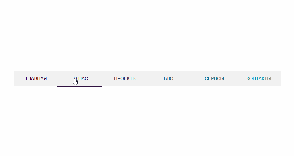
Представляю вашему вниманию горизонтальное меню с анимированной движущейся полосой на чистом CSS коде без применения JavaScript.
Раньше вид такого меню, а именно с таким эффектом, приходилось писать с применением обработчика JavaScript, теперь же все стало гораздо проще. Весь код меню написан на чистом CSS, и вы его сможете настроить под свои требования, задать цвет списков, назначить цвет полоски для отдельного элемента. Данное горизонтальное меню полностью адаптивно под различные разрешения мониторов.
Установка:
Для начала нам нужно указать саму HTML разметку
HTML
<ul>
<li class="current"><a href="#">Главная</a></li>
<li><a href="#">О нас</a></li>
<li><a href="#">Проекты</a></li>
<li><a href="#">Блог</a></li>
<li><a href="#">Сервсы</a></li>
<li><a href="#">Контакты</a></li>
</ul>
После чего пропишем стили нашего меню.
CSS
ul {
display: flex;
list-style: none;
text-transform: uppercase;
width: 100%;
box-sizing: border-box;
padding: 0;
margin: 0;
position: relative;
background-color: #f1f1f1;
}
li {
flex: 1 1;
position: relative;
}
li:last-child::after {
content: "";
width: 100%;
height: 3px;
background-color: transparent;
display: block;
transition: .3s ease;
position: absolute;
left: 0;
top: 100%;
}
li:nth-child(1).current~li:last-child::after {
left: -500%;
background-color: #360033;
}
li:nth-child(2).current~li:last-child::after {
left: -400%;
background-color: #301441;
}
li:nth-child(3).current~li:last-child::after {
left: -300%;
background-color: #263357;
}
li:nth-child(4).current~li:last-child::after {
left: -200%;
background-color: #1b546f;
}
li:nth-child(5).current~li:last-child::after {
left: -100%;
background-color: #117385;
}
li:nth-child(6).current:last-child::after {
left: 0;
background-color: #0b8793;
}
li:nth-child(1):hover~li:last-child::after {
left: -500%;
background-color: #360033;
}
li:nth-child(2):hover~li:last-child::after {
left: -400%;
background-color: #301441;
}
li:nth-child(3):hover~li:last-child::after {
left: -300%;
background-color: #263357;
}
li:nth-child(4):hover~li:last-child::after {
left: -200%;
background-color: #1b546f;
}
li:nth-child(5):hover~li:last-child::after {
left: -100%;
background-color: #117385;
}
li:nth-child(6):last-child:last-child:hover::after {
left: 0;
background-color: #0b8793 !important;
}
li:nth-child(6):hover::after {
left: 0%;
background-color: #0b8793;
}
li:nth-child(1) a {
color: #360033;
}
li:nth-child(2) a {
color: #301441;
}
li:nth-child(3) a {
color: #263357;
}
li:nth-child(4) a {
color: #1b546f;
}
li:nth-child(5) a {
color: #117385;
}
li:nth-child(6) a {
color: #0b8793;
}
a {
padding: 1rem;
display: block;
text-align: center;
text-decoration: none;
color: #666;
}
@media (max-width: 320px) {
ul {
flex-direction: column;
}
li:last-child::after {
margin-top: -1.5px;
}
li:nth-child(1).current~li:last-child::after {
left: 0;
top: -400%;
}
li:nth-child(2).current~li:last-child::after {
left: 0;
top: -300%;
}
li:nth-child(3).current~li:last-child::after {
left: 0;
top: -200%;
}
li:nth-child(4).current~li:last-child::after {
left: 0;
top: -100%;
}
li:nth-child(5).current~li:last-child::after {
left: 0;
top: 0;
}
li:nth-child(6).current:last-child::after {
left: 0;
top: 100%;
}
li:last-child::after {
left: 0%;
top: 0%;
}
li:nth-child(1):hover~li:last-child::after {
left: 0;
top: -400%;
}
li:nth-child(2):hover~li:last-child::after {
left: 0;
top: -300%;
}
li:nth-child(3):hover~li:last-child::after {
left: 0;
top: -200%;
}
li:nth-child(4):hover~li:last-child::after {
left: 0;
top: -100%;
}
li:nth-child(5):hover~li:last-child::after {
left: 0;
top: 0;
}
li:nth-child(6):last-child:last-child:hover::after {
left: 0;
top: 100%;
}
}
Мне нравится (6)
Раньше вид такого меню, а именно с таким эффектом, приходилось писать с применением обработчика JavaScript, теперь же все стало гораздо проще. Весь код меню написан на чистом CSS, и вы его сможете настроить под свои требования, задать цвет списков, назначить цвет полоски для отдельного элемента. Данное горизонтальное меню полностью адаптивно под различные разрешения мониторов.
Установка:
Для начала нам нужно указать саму HTML разметку
HTML
Код
<ul>
<li class="current"><a href="#">Главная</a></li>
<li><a href="#">О нас</a></li>
<li><a href="#">Проекты</a></li>
<li><a href="#">Блог</a></li>
<li><a href="#">Сервсы</a></li>
<li><a href="#">Контакты</a></li>
</ul>
После чего пропишем стили нашего меню.
CSS
Код
ul {
display: flex;
list-style: none;
text-transform: uppercase;
width: 100%;
box-sizing: border-box;
padding: 0;
margin: 0;
position: relative;
background-color: #f1f1f1;
}
li {
flex: 1 1;
position: relative;
}
li:last-child::after {
content: "";
width: 100%;
height: 3px;
background-color: transparent;
display: block;
transition: .3s ease;
position: absolute;
left: 0;
top: 100%;
}
li:nth-child(1).current~li:last-child::after {
left: -500%;
background-color: #360033;
}
li:nth-child(2).current~li:last-child::after {
left: -400%;
background-color: #301441;
}
li:nth-child(3).current~li:last-child::after {
left: -300%;
background-color: #263357;
}
li:nth-child(4).current~li:last-child::after {
left: -200%;
background-color: #1b546f;
}
li:nth-child(5).current~li:last-child::after {
left: -100%;
background-color: #117385;
}
li:nth-child(6).current:last-child::after {
left: 0;
background-color: #0b8793;
}
li:nth-child(1):hover~li:last-child::after {
left: -500%;
background-color: #360033;
}
li:nth-child(2):hover~li:last-child::after {
left: -400%;
background-color: #301441;
}
li:nth-child(3):hover~li:last-child::after {
left: -300%;
background-color: #263357;
}
li:nth-child(4):hover~li:last-child::after {
left: -200%;
background-color: #1b546f;
}
li:nth-child(5):hover~li:last-child::after {
left: -100%;
background-color: #117385;
}
li:nth-child(6):last-child:last-child:hover::after {
left: 0;
background-color: #0b8793 !important;
}
li:nth-child(6):hover::after {
left: 0%;
background-color: #0b8793;
}
li:nth-child(1) a {
color: #360033;
}
li:nth-child(2) a {
color: #301441;
}
li:nth-child(3) a {
color: #263357;
}
li:nth-child(4) a {
color: #1b546f;
}
li:nth-child(5) a {
color: #117385;
}
li:nth-child(6) a {
color: #0b8793;
}
a {
padding: 1rem;
display: block;
text-align: center;
text-decoration: none;
color: #666;
}
@media (max-width: 320px) {
ul {
flex-direction: column;
}
li:last-child::after {
margin-top: -1.5px;
}
li:nth-child(1).current~li:last-child::after {
left: 0;
top: -400%;
}
li:nth-child(2).current~li:last-child::after {
left: 0;
top: -300%;
}
li:nth-child(3).current~li:last-child::after {
left: 0;
top: -200%;
}
li:nth-child(4).current~li:last-child::after {
left: 0;
top: -100%;
}
li:nth-child(5).current~li:last-child::after {
left: 0;
top: 0;
}
li:nth-child(6).current:last-child::after {
left: 0;
top: 100%;
}
li:last-child::after {
left: 0%;
top: 0%;
}
li:nth-child(1):hover~li:last-child::after {
left: 0;
top: -400%;
}
li:nth-child(2):hover~li:last-child::after {
left: 0;
top: -300%;
}
li:nth-child(3):hover~li:last-child::after {
left: 0;
top: -200%;
}
li:nth-child(4):hover~li:last-child::after {
left: 0;
top: -100%;
}
li:nth-child(5):hover~li:last-child::after {
left: 0;
top: 0;
}
li:nth-child(6):last-child:last-child:hover::after {
left: 0;
top: 100%;
}
}